Global financial information made simple. New logo, tagline, visual identity, magazine and website for one of the largest newsbrands in Brazil.
MADE AT XP INC. IN 2012 / ROLE: CREATIVE SUPERVISOR, LEAD DESIGNER / CLIENT: XP INC.
—
Also operating as the publisher of Invista Magazine, the brand embraced the mission of helping people make right decisions about their money based on high-quality information.
Thanks to its notable growth, InfoMoney was acquired by XP Inc. in late 2011. XP Investimentos – XP Inc.’s flagship brand and former brokerage firm – had just been transformed into a full investment company and was in need of reaching not only stock traders but investors in general. With its tools, InfoMoney would fit perfectly into XP Investimentos’ new business model and could help increase the company’s client base and assets under management.
To achieve this goal, XP’s leadership decided it was time to revisit InfoMoney’s branding and communication strategy. The brand should be able to engage not only seasoned readers but also a more diverse audience. The idea was to grow the number of users and magazine subscribers so they could be converted into XP clients later.
In early 2012, I was in charge of updating InfoMoney with a new and comprehensive visual identity that would profoundly impact the brand’s deliverables. Although not participating in the development of the brand strategy, I was in charge of updating InfoMoney’s logo, tagline, website and magazine.
Previous Logo and Visual Identity
Before and After
Information worth money —
CREATIVE CONCEPT AND TAGLINE
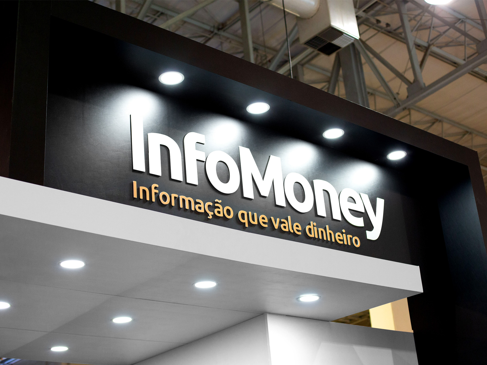
In order to reach a broader audience, the brand needed to express itself more straightforwardly. The new tagline “Informação que Vale Dinheiro” (Information Worth Money) summarises InfoMoney’s core business in a few words and gives a clear example of its direct language.
—
Less clutter, more recognition —
LOGO
The brand's distinct name was already memorable enough. The logo just needed to make better use of that. The new wordmark, made using Ubuntu Bold as a starting point, thrives at all scales and is easier to replicate across different media.
—
Putting information in the leading role —
COLOURS
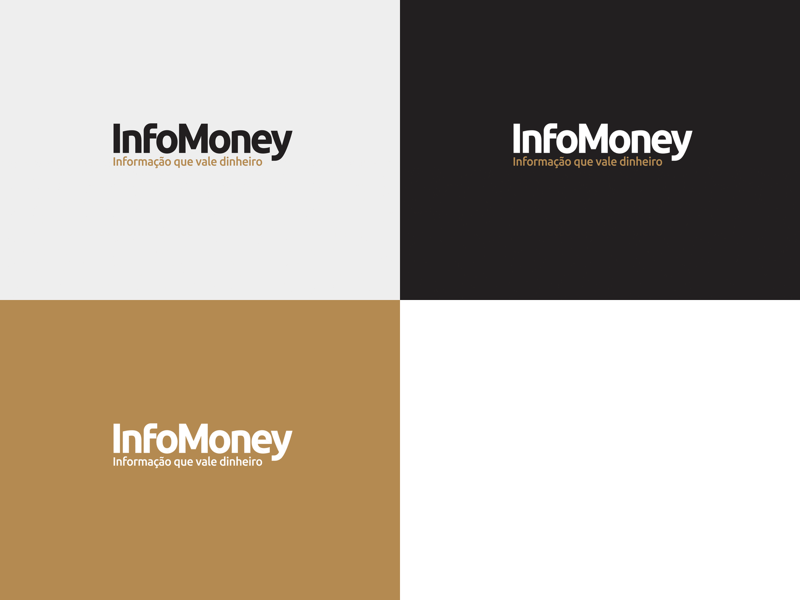
The brand's primary colour palette is neutral enough to let typography, pictures and illustrations take the lead, while the secondary palette is flexible enough to successfully identify different sections and contents.
—
Smart impact —
TYPOGRAPHY
InfoMoney's new typographic expressions were created to instantly capture the essence of the brand's business while working well across all media. The Soho and Soho Gothic type families provide bulky display fonts for editorial impact and also more refined variations that ensure good legibility in small dimensions.
—
Two sides of the same story —
ONLINE AND PRINT MEDIA
Magazine and website were overhauled to seamlessly complement each other and create a cohesive visual identity while delivering easy-to-read content. Both media now featured shorter and more playful headlines, avoiding the excess of technical terms. Most stock images were replaced by lots of illustration from top Brazilian artists.
—
The results —
Within a year, InfoMoney's website reached the mark of 1 million unique visitors, while the magazine experienced a 32% increase in the number of copies sold. Account openings in XP Investimentos tripled, and the number of users purchasing paid content from XP increased 400%.
SOURCE: XP INC.
—


